You might have seen Noble Schools’ new logo around Chicago on billboards, masks, and t-shirts. Now, we’re telling the story behind it, who was part of creating the logo, and what it took to make it come to life.
This fresh new look reflects the way we are changing — the way we are overhauling our policies and practices to provide an anti-racist education. Each part of our new logo is significant to visually represent this evolution.
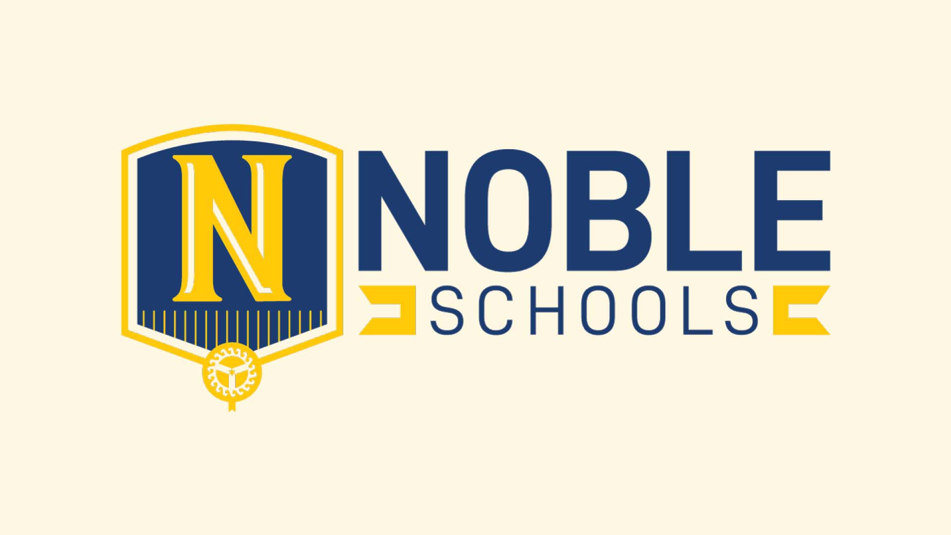
Here’s a quick breakdown of the meaning behind our logo:
THE SHIELD
The shield on our logo was made to look like an open book. It represents our commitment to learning, a higher quality public school education, and preparing our students for college.
THE 18 PILLARS
At the bottom of our shield, we have 18 lines. These are pillars of success and represent all 18 of our campuses.
THE CHICAGO MUNICIPAL DEVICE
Also at the bottom of our shield, we have the Chicago municipal device.
The intersecting lines in the device symbolize the confluence, or junction, of the north, south, and main branches of the Chicago River. This confluence divides the city into three parts but also ultimately brings it together. You can read more about the history of the device from the Chicago Design Office’s website.
We included the municipal device in our logo to show that we ARE Chicago and we embrace the city we serve.
CHICAGO STAR

We also included a six-pointed Chicago star at the center of the municipal device. This represents how Noble is at the center of educational equity.
THE WAVES

Around the municipal device, we added waves to represent Lake Michigan and our place in the Midwest. There are 18 of them to again portray our 18 campuses.
THE STORY
We started by creating a steering committee to help us form this new look. We gathered teachers, parents, board members, and staff from across Noble to be on this committee. They reviewed over 150 different variations of what the logo could be before finally settling on the final version.
“The first set of logos– it was a pretty rough meeting. There was a lot of like: ‘This is just not gonna work.’” said Anna Brune, one of the committee members and the Noble League Marketing Manager.
“It was really interesting to see the amazing work to take all of that feedback and make something that people actually saw and were like, ‘Yeah, that’s the one.’” She said.
Both those involved in the brand refresh process and those that are seeing it come out now are excited for what this change means for Noble.
“You get to tell a new story. You get to tell exactly where your stance is with anti-racism. You get to tell your students and your community that we do care,” said Jeri Mack, a board member and Hansberry College Prep parent.
