
By Tyler Portis, he/him, Assistant Director of College Analytics
When I was 10, I spent my afternoons on gradebook.com—plugging in my classmates’ names, creating fake assignments, entering scores, and watching final grades automatically update. In high school, I built Excel spreadsheets to game my finals. Then, I finally pursued a Master of Education in Student Affairs after watching a friend struggle because no one caught her academic decline early enough.
I love the systems that make teaching possible, and I have found my strengths in building them. Now, I get to do that on a much larger scale as Assistant Director of College Analytics.
As educators, we know how important it is to make data-informed decisions. Research consistently shows that systematic processes and data strategies that support learning and ensure students receive the right resources, such as early warning systems and other data-intensive educational models, have an overall positive effect on student success. At Noble, we prioritize this. That’s the work I’ve been doing, along with Noble’s 7-person data team.
We serve our students and staff across 17 campuses by ensuring data is embedded in everyone’s daily work and isn’t locked in the central office. Our aim is to give all staff easy-to-use data tools and resources so they can make timely, data-informed decisions that better support our students.
So, how do we do this? And what can educators take away from our approach?
What Data Looks Like at Noble
Like most K-12 organizations, Noble has information galore: attendance, grades, discipline records, parent contacts, etc. The challenge isn’t having data. It’s accessing it in ways that educators can actually use to support students. Over 16 years ago, Noble recognized this and imagined what more robust reporting could look like— leading to my work and the data team’s work today.
We have two main goals: create helpful tools that save teachers and admins time, and provide them with accurate information that helps them focus on the areas that matter most.
On the information delivery end, we started with two dashboards. The Advisory Dashboard helped advisors see which students needed check-ins based on grades and attendance. The Network Dashboard gave network and campus leaders a daily view of each campus’s outcomes—not for competition, but for collaboration and in-year adjustments. Those first dashboards didn’t solve everything, but they proved that putting live data in educators’ hands changed how they worked — and we kept building from there.
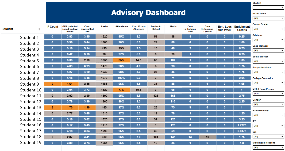
The advisory dashboard gives advisors an overview of where their students are, from attendance and GPAs to behavior logs and the number of F grades. The dashboard highlights spots in orange to flag which students might need targeted support.
Now we have over 75 active dashboards that serve the many staff functions at Noble— academics, promotion, culture/behavior, student experience, college success, operations, etc. We design our tools to trigger immediate action by asking: where should attention go, and what decisions should follow? We partner with campus staff to ensure our data isn’t just visible, but actionable.
A primary example is the “Analyze: Teachers and Logs” page within our Culture Dashboard. This tool was born directly from a partnership with campus leaders who shared the difficulty of addressing equity issues in behavior logs (behavior infractions) at the individual classroom level. To aid in this, we built a specific visualization that shows the difference between the percentage of students from a particular group in a teacher’s classroom and how often that group’s behavior is recorded in the logs. This chart immediately draws a leader’s attention to disparities that might otherwise stay hidden in a spreadsheet. By putting this data at the teacher level, instructional coaches can move past anecdotal observations and engage in reflective, data-backed coaching conversations. These dialogues help staff identify unintended bias and adjust practices to ensure equitable disciplinary experiences for all students.
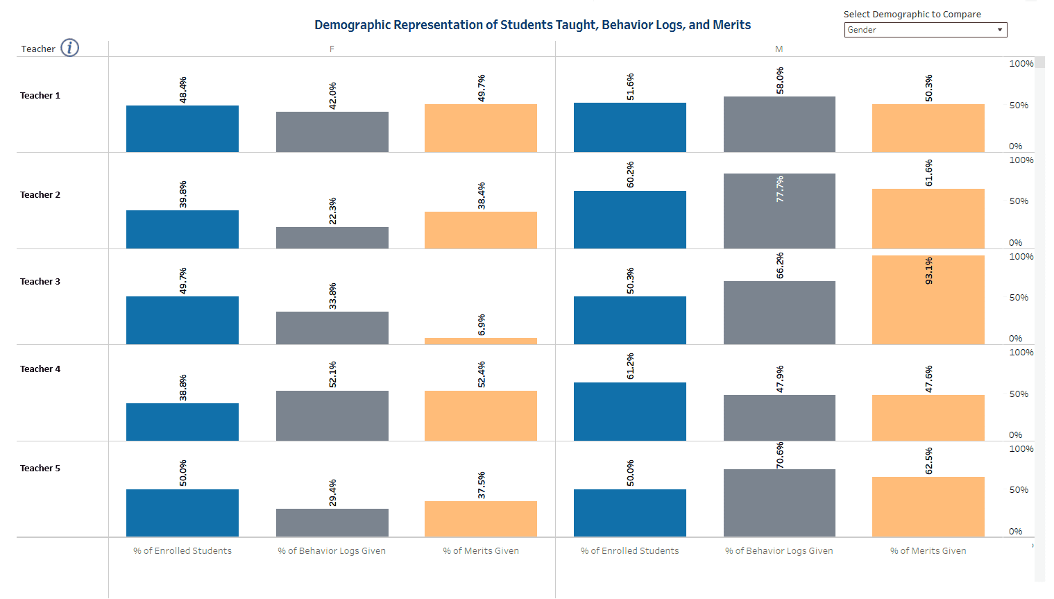
Looking at the visual, a teacher/coach can review the percentage of a teacher's issued behavior logs (behavior infractions) and merits (positive behavior points) that went to a specific student group compared to their classroom roster makeup. For example, 77% of the behavior logs Teacher 2 assigned went to Male students, yet Male students only make up 60% of the teacher's class rosters. This is an overrepresentation of 17 percentage points, which may warrant further reflection.
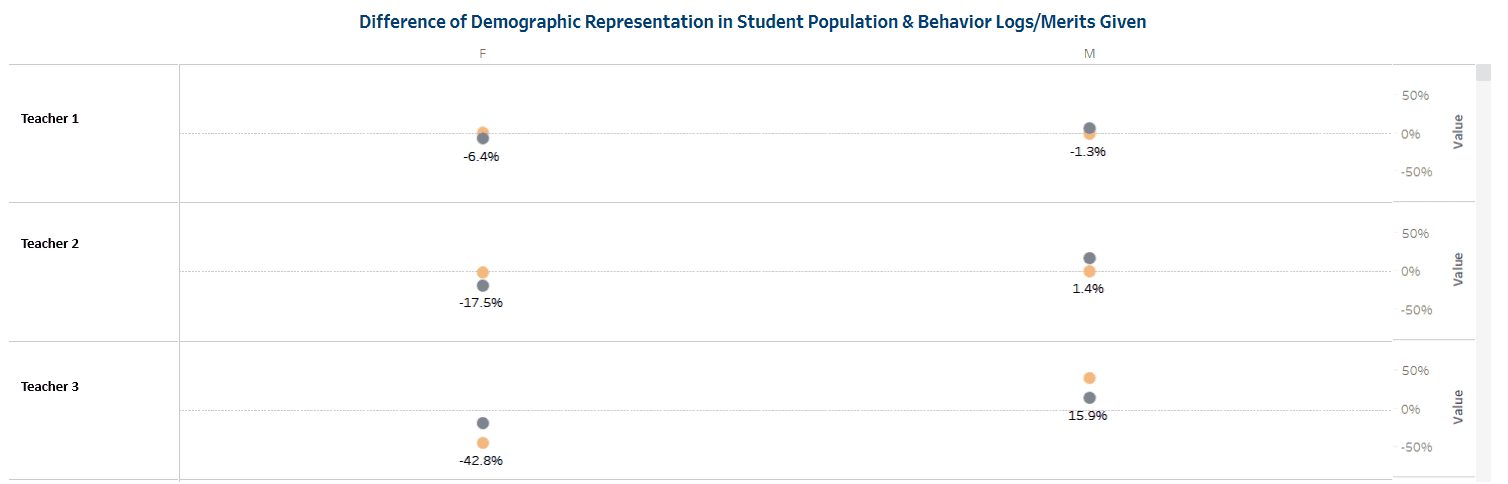
This graph plots the difference between percentage of students enrolled by gender (blue dot) and the percentage who received merits (orange dot).
The efficiency of this “self-service” model cannot be overstated. If a single administrator attempted to compile this reporting manually, they would need to download five or more spreadsheets from the student information system and spend at least five hours navigating complex formulas and data organization. Instead, our staff has on-demand access to these dashboards, which refresh daily, enabling continuous, year-round monitoring.
With an in-house data team, we have the unique ability to create these highly tailored tools to meet the specific needs of our campuses. This level of data access and practical usage is what makes Noble unique, but it is not the result of an overnight shift. It is a 16-year commitment to the idea that while data is plentiful, using it in ways that truly matter is what drives student outcomes.
Improving Data Use at Your School/District
If your school/district is closer to the beginning of this journey, here’s how to start thinking about how data could trigger purposeful action for students:
About access: Do all staff who need data have access to it? Is it current enough to inform timely decisions? Do educators trust its accuracy?
As I said earlier, Noble went the self-service analytics route. All staff have access to all data relevant to their roles, and nearly all of these dashboards refresh at least daily. It took a lot of time to build these systems. To start small, hold a team meeting to outline impactful job roles in the building, the tasks they perform, and the data necessary or helpful to perform those tasks well. Then, circle data that comes up repeatedly across role types (content teacher, paraprofessional, instructional coach, admin, etc). Look at those circled metrics and think about how often that data needs to be updated so staff can make timely decisions. Then, see if it’s realistic to collect the data that often without sacrificing accuracy.
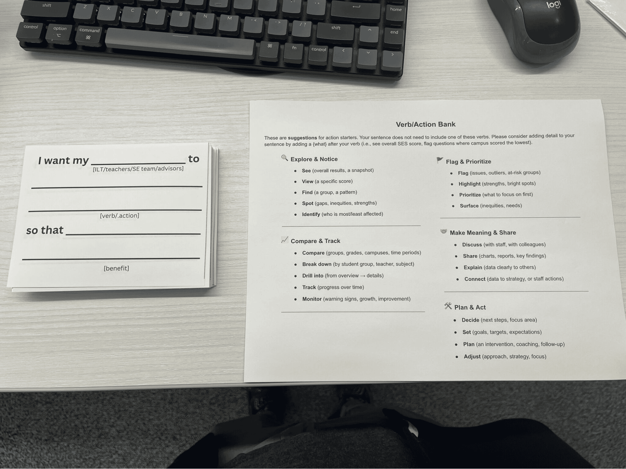
I met with Noble's principals and chiefs to gather early feedback on a new Tableau dashboard. Instead of asking, “What should be on the dashboard?" I facilitated a structured activity in which I instructed principals to complete these cards. They wrote responses, posted them on boards, did a gallery walk, and marked the most important ideas.
About usability: Can educators get answers quickly, or do they need advanced skills to pull basic information? When someone opens a dashboard, is it clear what they should focus on first? Are there data analysis processes you ask your team to do repeatedly that could be automated?
After collecting all selected data, consider how to visually present that information. Think about those roles from earlier. Ask what they need to know to make effective decisions, then make sure that information is easy to find on the dashboard or spreadsheet. For example, if you find out that instructional coaches need to see the average GPA for each class to identify which ones need support, create a report that not only shows them that data but also uses colors or symbols to flag specific classes you’d want your team to follow up on.
About action: When educators look at data, do they know what to do with it? Are data tools connected to actual workflows, such as intervention planning or resource allocation? Can you point to specific students who received support because a tool surfaced their need?
If you have a plan for what your team member needs to do with the data insights, think about how the tools can help them get started easily. If it is diving deep into data, link to a Google Sheet with a customizable data summary (pivot table) so they can easily filter and organize information. If it’s printing personalized office hour invitations for students, have a template linked in the tool, or, better yet, if the skills are there, develop a Google Apps Script to semi-automate the process. The goal here is to reduce the mental load and amount of work required to perform the tasks we direct our teams to do.
About improvement: Do you ask staff what’s working? Do you have processes for improving tools based on how people use them?
Have quarterly or semiannual check-ins where you observe staff actually using the data tools. Without intervention, watch what they click on (and places they don’t click). Ask yourself if they are using all the features as intended. Question if it’s because the user doesn’t know how to use it, or if it is an issue with the design itself. Talk with staff about which roles, workflows, and data points to prioritize to make your tools more useful to them. Adjust or add to your tools and resources according to that feedback.
Why This Work Matters
All of this matters because of who it serves. Our students deserve leaders and teachers who can see problems clearly and act differently.
A dean quickly identifies students with consecutive absences and reaches out before things spiral out of control. A department head sees which student groups are falling behind and adjusts instruction. An advisor spots students reporting low social-emotional learning competencies and connects them with support.
It’s in those moments—when we deploy limited resources more strategically because we know who needs what when—that data triggers purposeful human action that positively impacts students.
When we get it right—when we build infrastructure that makes data accessible, tools designed for real users, training that builds confidence, and systems that continuously improve—we help educators catch students sooner, intervene more strategically, and support every young person in reaching their potential.
That’s the work we’re doing at Noble. And it’s worth doing well.